


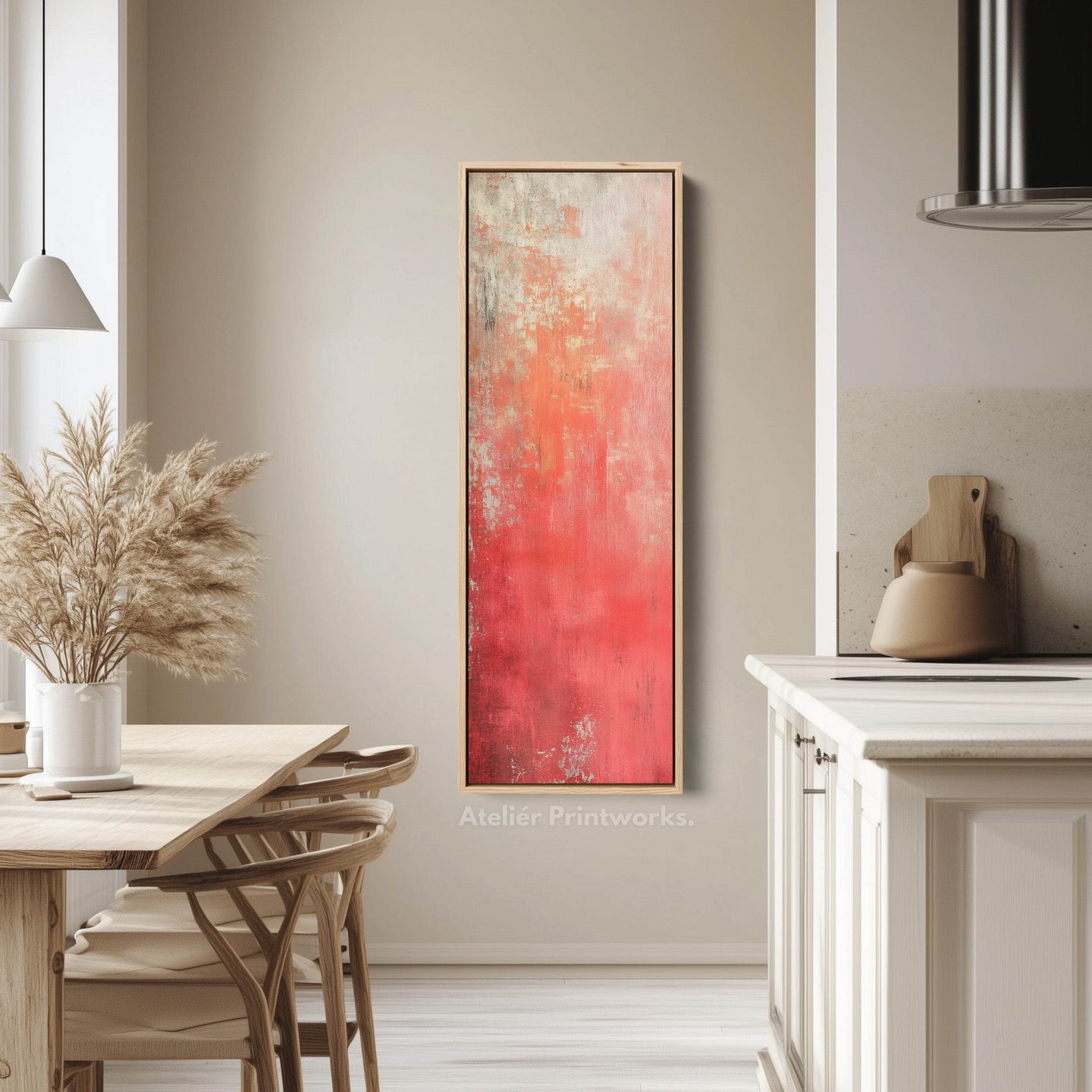
Rood
Rode wanddecoratie in lange, smalle formaten – canvasprints ontworpen voor gangen, trappenhuizen en smalle wandruimtes waar standaardformaten niet passen. Van diep karmozijnrood tot levendig scharlakenrood omvat de collectie krachtige abstracte werken, op Japan geïnspireerde prints, botanische motieven en moderne patronen, zowel verticaal als horizontaal.
Rood is een kleur die je bewust toepast. Eén lang, horizontaal werk boven een bank of eettafel vormt het middelpunt van een neutrale ruimte, terwijl een hoge, verticale print warmte toevoegt aan een gang of trappenhuis zonder dat het geheel benauwd oogt. Diepere karmozijntinten passen goed bij historische interieurs en donkere kleurenschema’s; helderdere scharlakenrode tinten komen het best tot hun recht tegen witte of lichte muren.
Elk werk wordt op bestelling gemaakt in verschillende formaten, als opgespannen canvas of in een zwevende of klassieke lijst in zwart, wit, eiken, walnoot of goud, en wordt klaar om op te hangen geleverd.


Red wall art - frequently asked questions
Afmetingen, ophanghoogte en de vragen die ons het vaakst worden gesteld.
Is red wall art too much for a home?
Used once, deliberately, it is the most effective focal point you can put on a wall. A single long red canvas above a sofa or dining table gives a neutral room somewhere for the eye to land. Used twice in the same room, it stops being a focal point and starts being a colour scheme - which is a much harder thing to get right.
What wall colour works behind red art?
White and pale walls suit brighter scarlets - the contrast keeps the red clean. Deeper crimsons work better against a warmer or darker wall, where they read as rich rather than as loud. A red piece on a red-adjacent wall, such as terracotta, rarely works: the two compete instead of contrasting.
What rooms suit red wall art?
Dining rooms and living rooms, where a focal point is welcome and the room is used socially. Hallways take a single red piece well because you pass it rather than sit with it. It is the hardest colour to live with in a bedroom, where it tends to read as energising rather than restful.
What shades of red wall art are available?
Deep crimson through to vibrant scarlet, with some rust and burgundy at the warmer end. Crimson and burgundy suit period rooms and darker schemes and read as rich rather than bright; scarlet is the statement end and needs a pale wall and some space around it.
What styles does red wall art come in?
Bold abstracts, Japanese-inspired prints, botanicals and modern patterns, in both vertical and horizontal formats. The Japanese-inspired pieces are where red is most at home - it carries real meaning in that tradition - while the abstracts use it purely as energy.


Laat je inspireren
Onze kunstwerken, jouw muren
Bekijk hoe onze klanten Ateliér Printworks stukken in hun huizen stylen. Van smalle gangen tot opvallende muren, deze ruimtes laten zien hoe de juiste verhoudingen het verschil maken.
Let customers speak for us
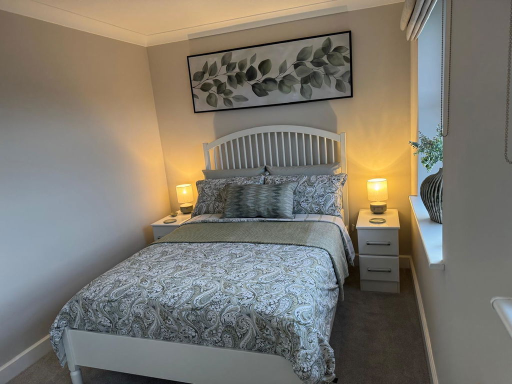
Excellent service, picture looks amazing and arrived very quickly and was very well packaged. Easy to install on the wall and looks superb..
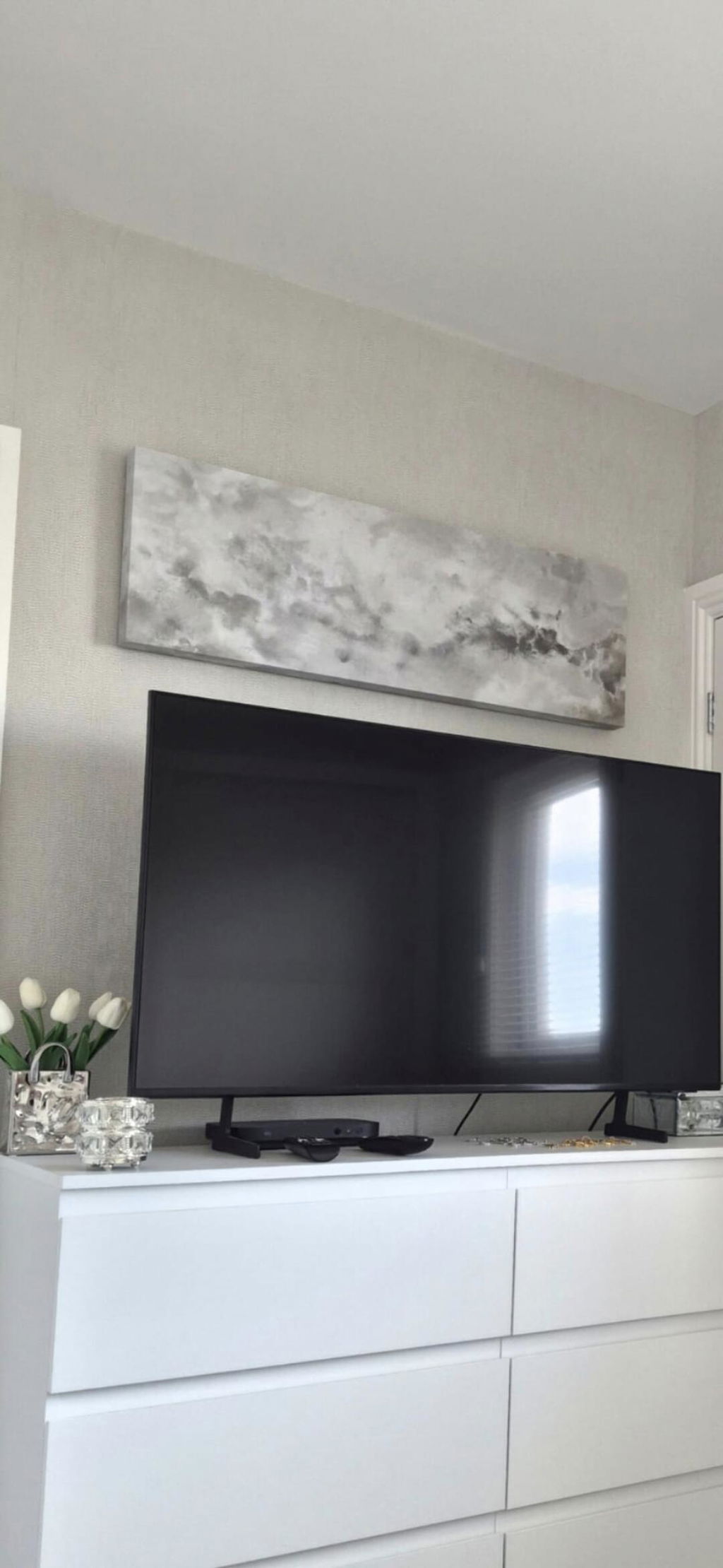
Lovely picture, great quality and supernatural delivered. Would definitely recommend
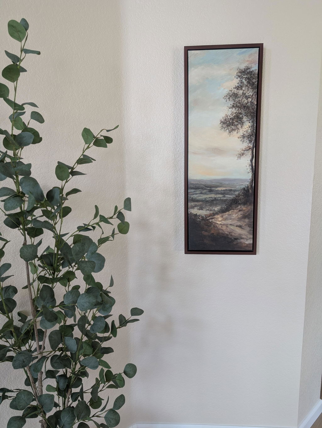
Beautiful picture for a narrow wall. The colors are prettier in person.
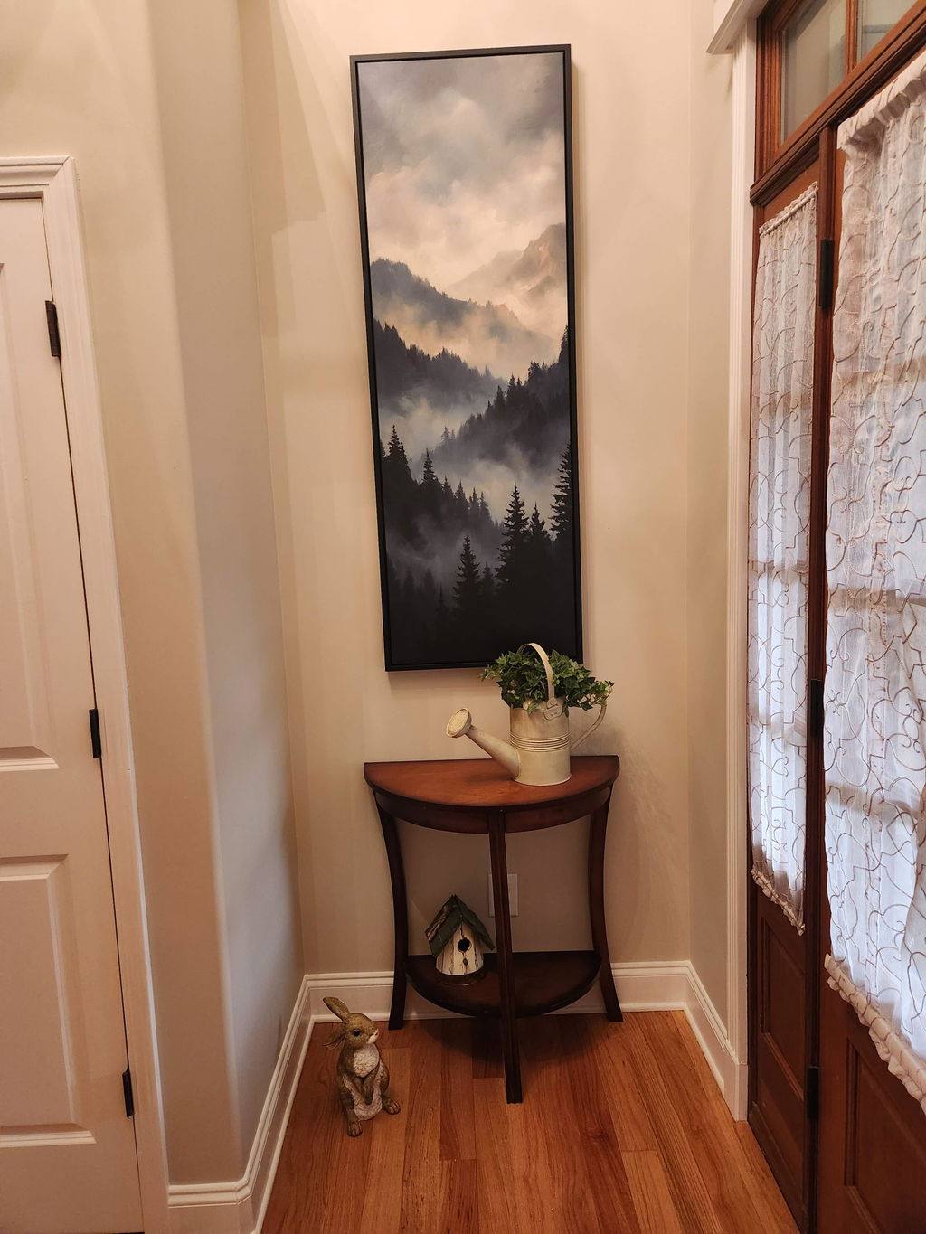
We received our print in a timely manner. Upon unpacking, we noticed a bulge in the canvas and some lines in the canvas and imprint from the wood that goes across in the back. I reached out and the company sent another one that came perfect. It is now displayed in our foyer and looks great!
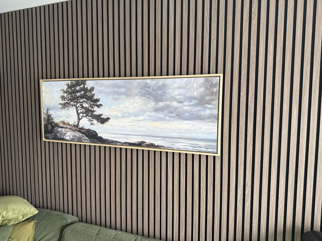
Beautiful, just as I wanted, excellent framing and a swift delivery
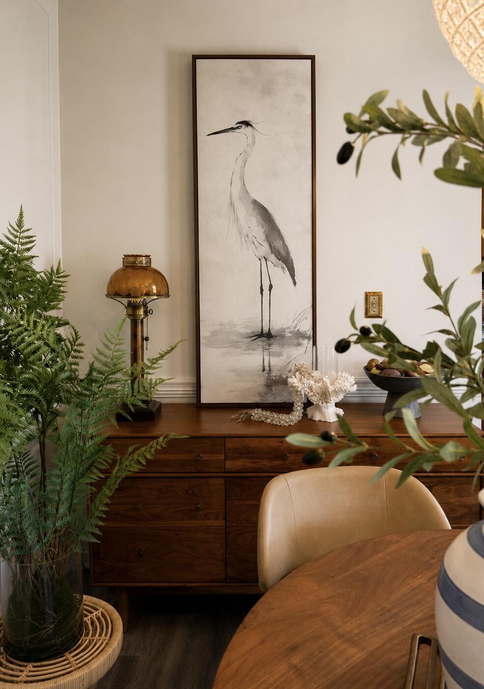
The perfect statement piece. The graceful heron, soft neutral palette, and walnut floating frame brought warmth and serenity to our dining room. It feels elegant, timeless, and collected rather than trendy. The quality is exceptional and the artwork looks even more beautiful in person than online. I love it so much, that I’m going to order another!
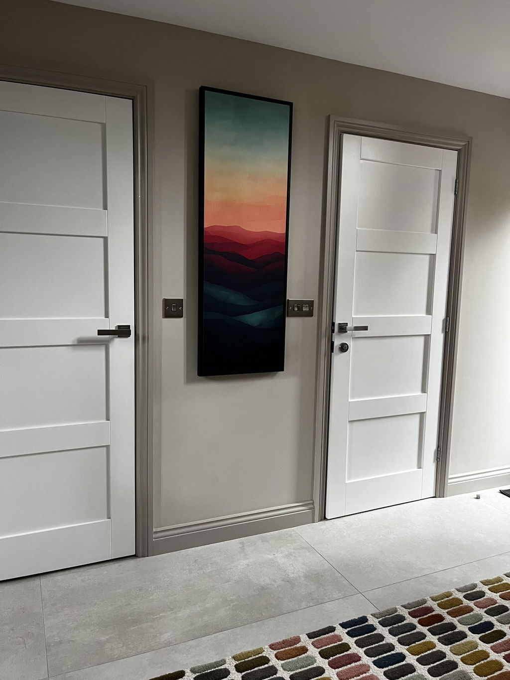
I’m over the moon with my beautiful Sunset wall art. It finishes off my hallway and has received so many compliments from visitors.
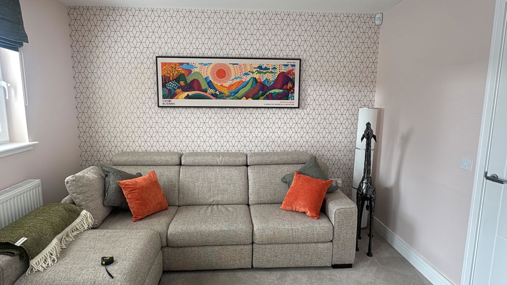
Second piece bought now and both are great. Exactly as described and very well packaged for transit.
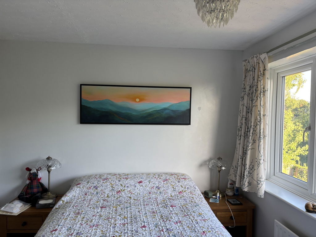
I love the quality and styling of the print, I was unsure about buying something so big without seeing it but I am very happy with the product. The colours are true to the image and the effect with the floating frame is perfect. I would buy again from Atelier, I trust the product and delivery was quick considering it was a specific design, size and frame.
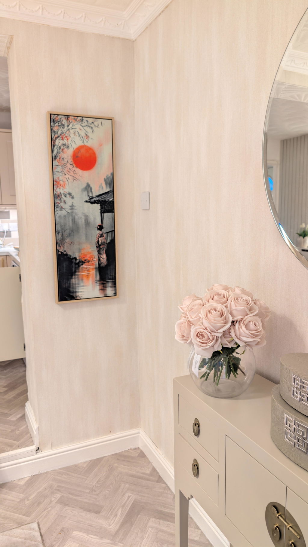
I bought the 30 x 90 canvas with a floating canvas frame in the colour wood and I couldn't be happier with it. Great quality, well packaged. Highly recommend.
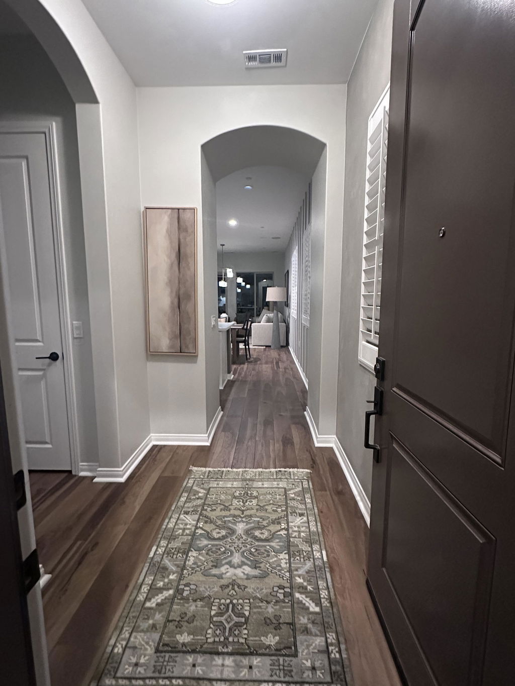
This artwork brought just the right look to my entry that I was trying to achieve. It’s beautiful and calming and in a beautiful quality frame.
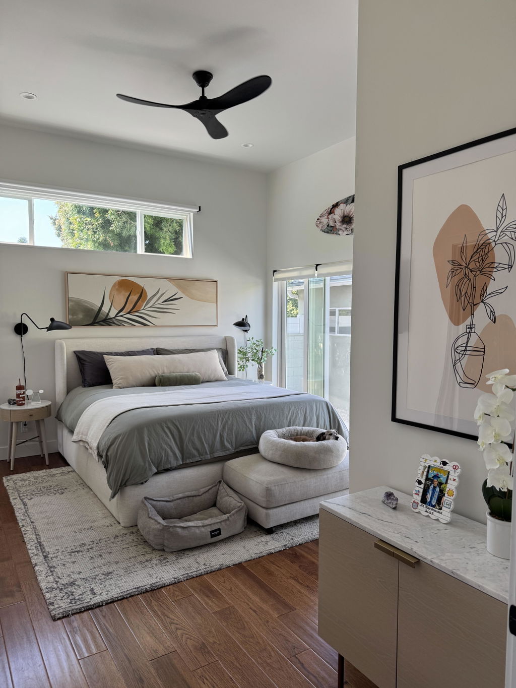
Better than presented online. We love it. Super high quality framing and hardware.
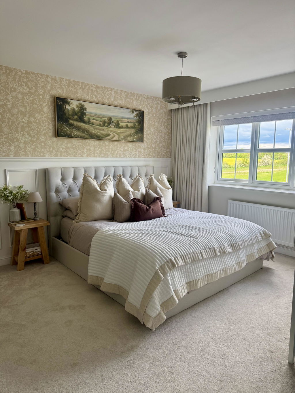
Beautiful artwork! So impressed with the quality, it looks absolutely stunning.
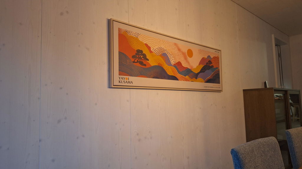
Beautiful!
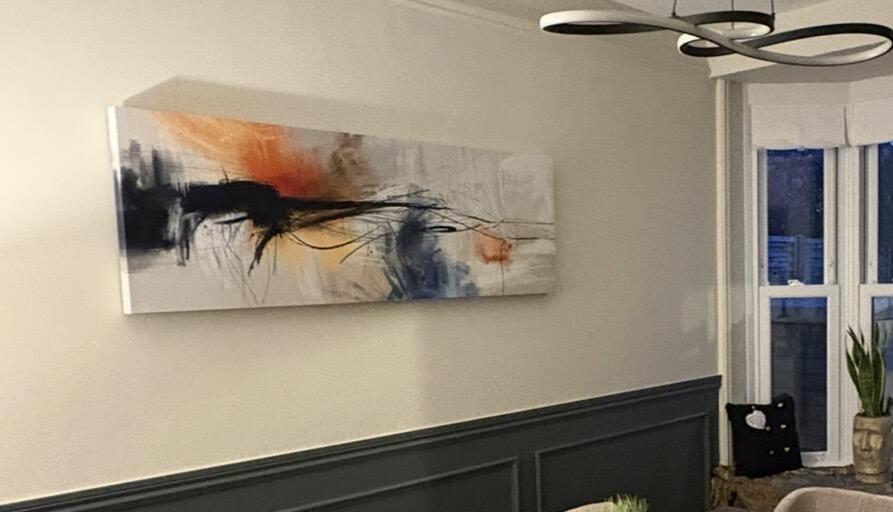
Lovely print. Really good quality & easy to hang