


Gold Wall Art
Gold wall art in long, narrow formats - canvas prints with a warm metallic character that catches the light as it moves across a room. Gold tones add contrast to a minimal scheme and depth to a richer one, without the coolness of silver or the flatness of plain yellow.
A small, carefully chosen range: gilded abstract compositions, Japanese-inspired forms and refined botanical line work. These pieces are made for hallways, staircases and the wall above a bed or sofa, where a long format has room to be seen.
Made to order in a range of sizes, as a stretched canvas or in a floating or classic frame in black, white, oak, walnut or gold, and delivered ready to hang.


Gold wall art - frequently asked questions
Sizing, hanging height and the questions we are asked most.
Does gold wall art look tacky?
It depends entirely on the amount. Gold used as an accent within a composition - a gilded line, a leaf edge, a band of warm metallic against neutral - reads as refined. Gold used as the whole surface reads as ornament. This is a deliberately small collection for exactly that reason: gold works in small quantities.
What is the difference between gold and yellow wall art?
Gold is metallic and reflective, so it changes as the light moves across a room and reads warmer and richer than a flat colour. Yellow is a pigment - brighter, flatter and more cheerful. If you want warmth and depth, look at gold; if you want light and lift, look at yellow.
Where does gold wall art work best?
Hallways, staircases and the wall above a bed or sofa - places with enough light for the metallic tone to do something as you move past. It adds contrast to a minimal scheme and depth to a richer one. It is least effective in a dim, windowless room, where the reflectivity that makes gold interesting has nothing to work with.
What colours go with gold wall art?
Deep tones give gold the most to work against - navy, forest green, charcoal and black. Warm neutrals like cream and clay give a softer, more understated result. Gold against a bright white wall can look stark, so it usually wants either a coloured wall or a warm frame to bridge the two.
Should a gold artwork have a gold frame?
Usually not. A gold frame around a gold artwork removes the contrast that makes the metallic tone visible, and the two rarely match exactly. Walnut, black or a stretched canvas with no frame all work better. Reserve the gold frame for a piece where gold is only a small accent within a mostly neutral image.


Get inspired
Our Artwork, Your Walls
See how our customers style Ateliér Printworks pieces in their homes. From narrow hallways to statement walls, these spaces show how the right proportions make all the difference.
Let customers speak for us
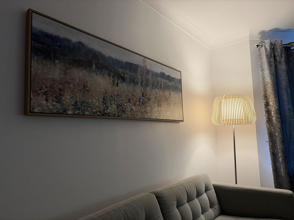
I love the canvas so much! Really finishes off the room! I turned my chair around because I just wasn’t to look at the canvas instead of the TV. The floating frame looks perfect. It’s a great blend of traditional but still with a modern clean look.
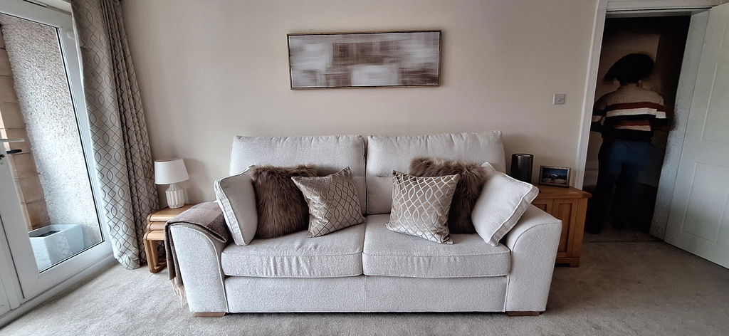
Great quality workmanship from the outset. The quality of the artwork is excellent and the accompanying frame makes the final product a standout in any room.
From the initial decision to the final delivery, the entire process was seamless, with the artwork delivered within five working days.
The hardest part was choosing which wall to hang the canvas on.
Thank you and I'm already looking towards make a further purchase.
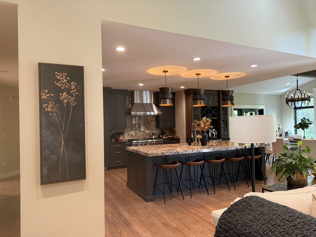
I have searched for a couple of years for a slender piece of art that would be the perfect complement to my kitchen. Scale and color were crucial as I didn’t want to distract from the elements in my kitchen. When this came across my Instagram feed I immediately ordered. The quality is excellent and delivery was fast!
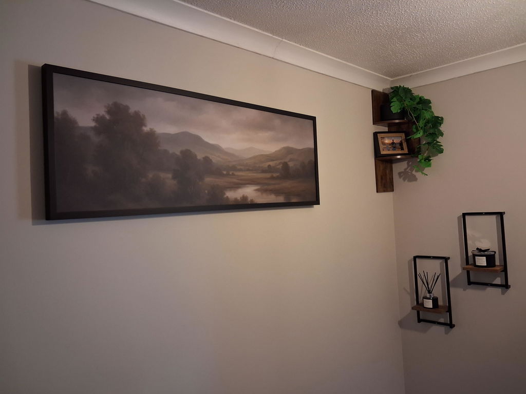
Absolutely Lovely Canvas. Fills the space and is beautifully made.
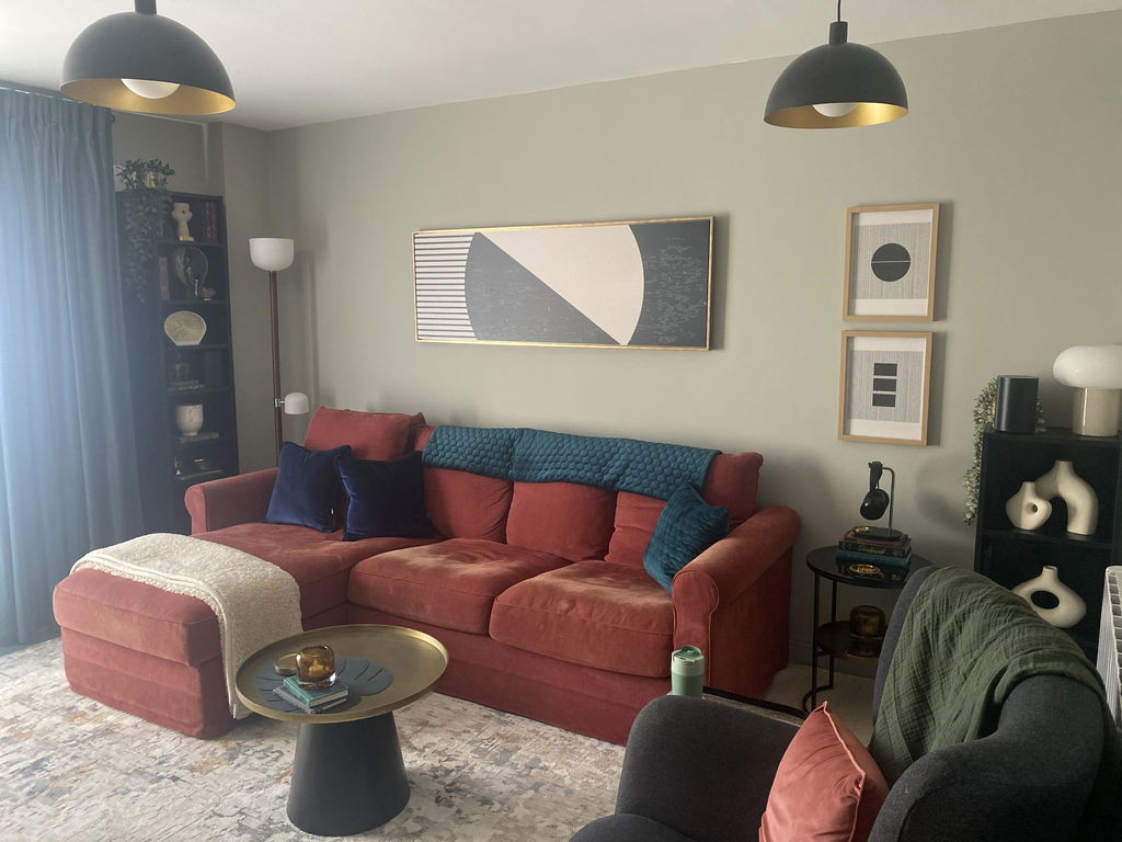
After much consideration I think the canvas I chose looks great for my space - beautifully made, stunning floating gold framed border - the only thing is I wished they used a different delivery service- the canvas arrived in IRL quickly - trying to get it delivered from UPS was a nightmare, I ended up collecting it from their warehouse. The canvase was worth it though.
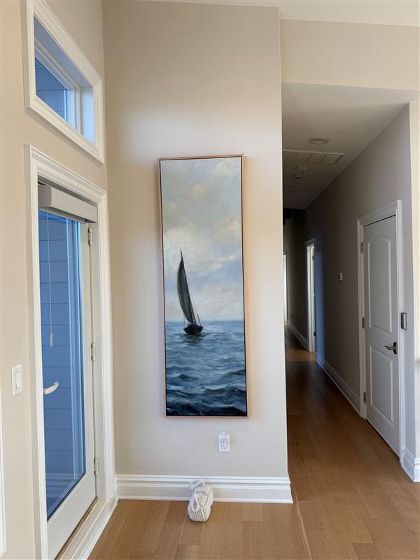
Love this piece! Fit the tall narrow wall exactly as we had hoped. Very impressed with the sturdiness of the piece itself, and the packing/shipping was done professionally.
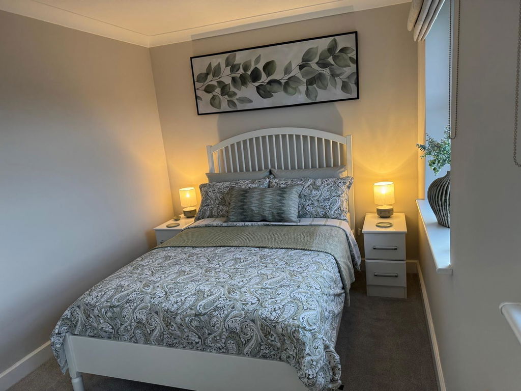
Excellent service, picture looks amazing and arrived very quickly and was very well packaged. Easy to install on the wall and looks superb..
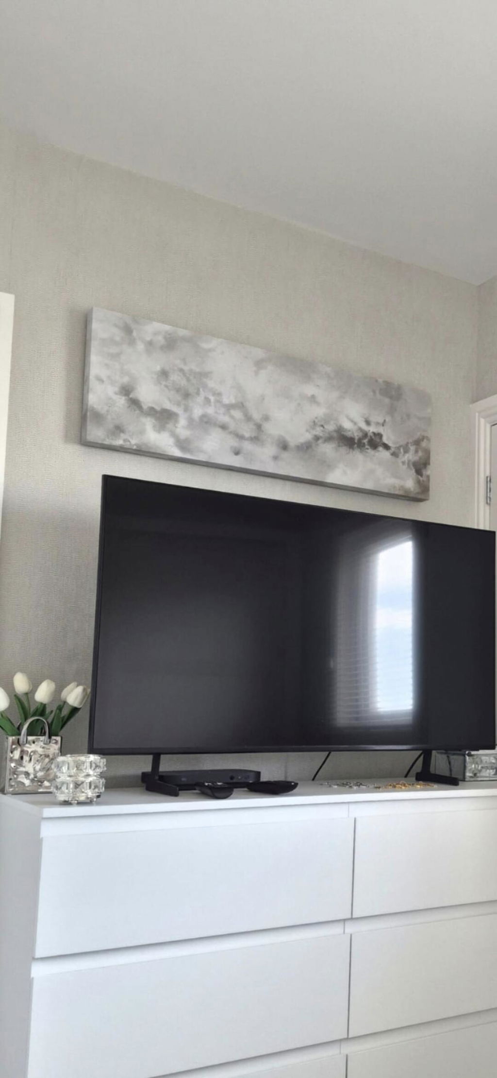
Lovely picture, great quality and supernatural delivered. Would definitely recommend
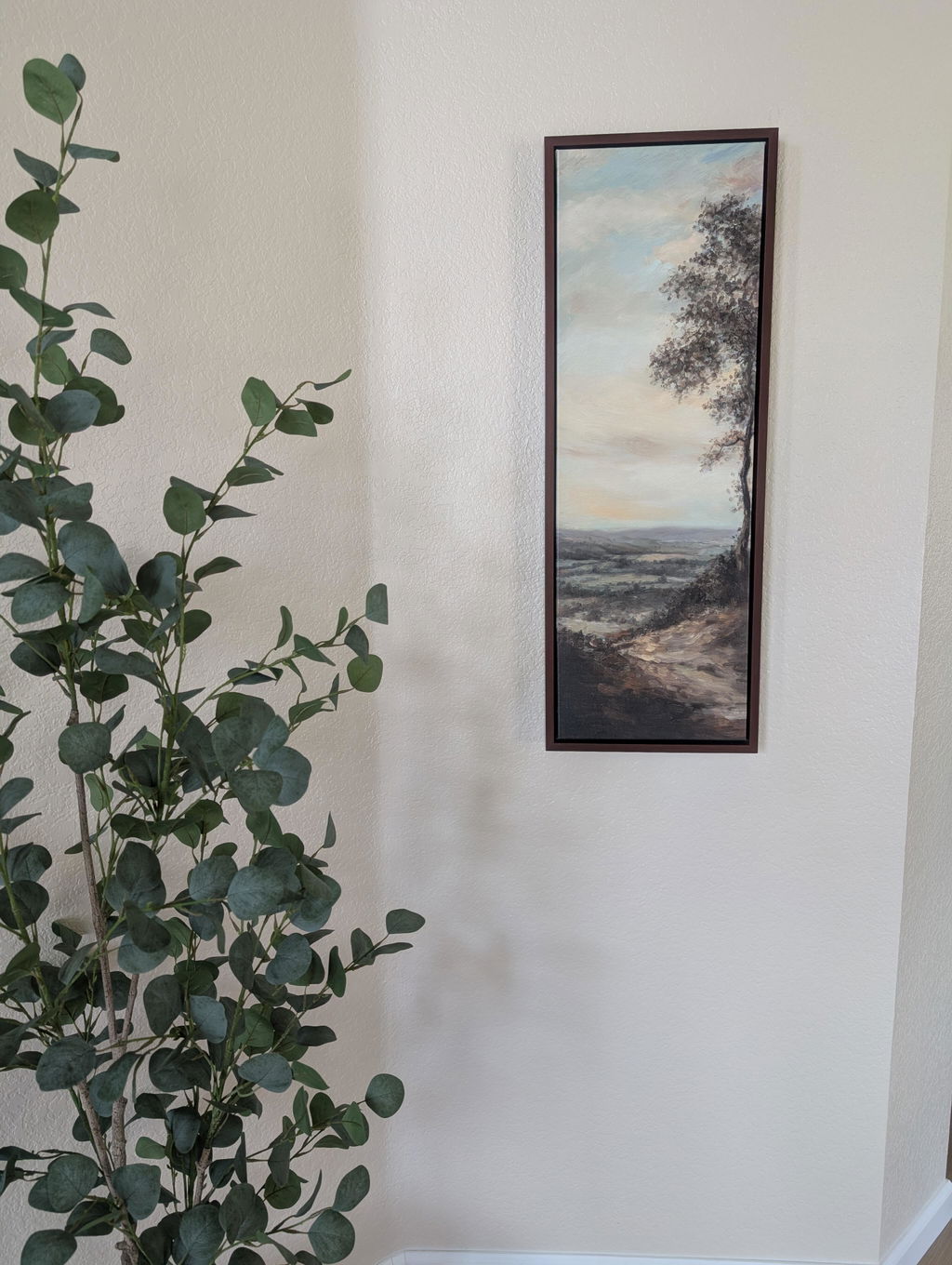
Beautiful picture for a narrow wall. The colors are prettier in person.
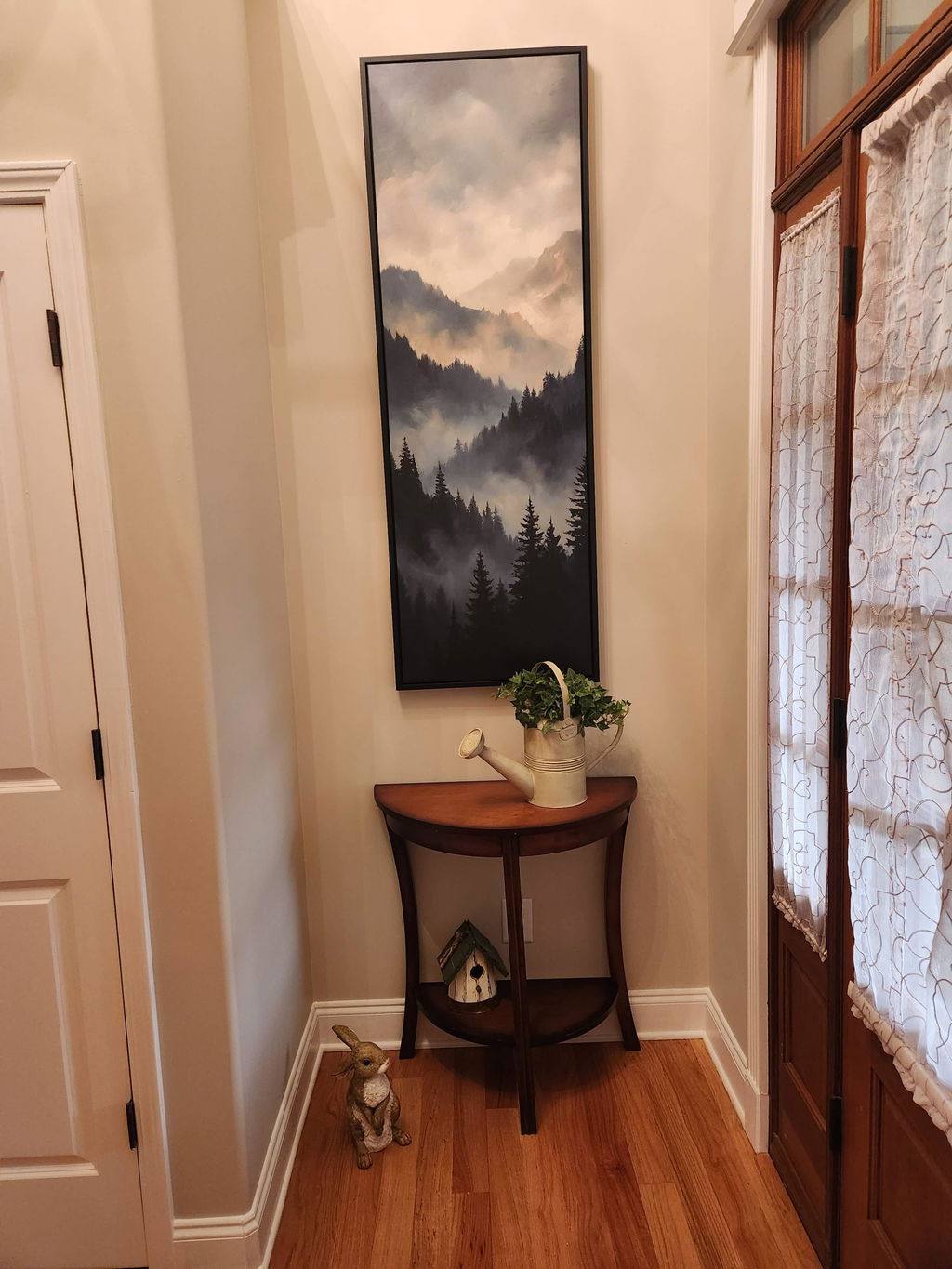
We received our print in a timely manner. Upon unpacking, we noticed a bulge in the canvas and some lines in the canvas and imprint from the wood that goes across in the back. I reached out and the company sent another one that came perfect. It is now displayed in our foyer and looks great!
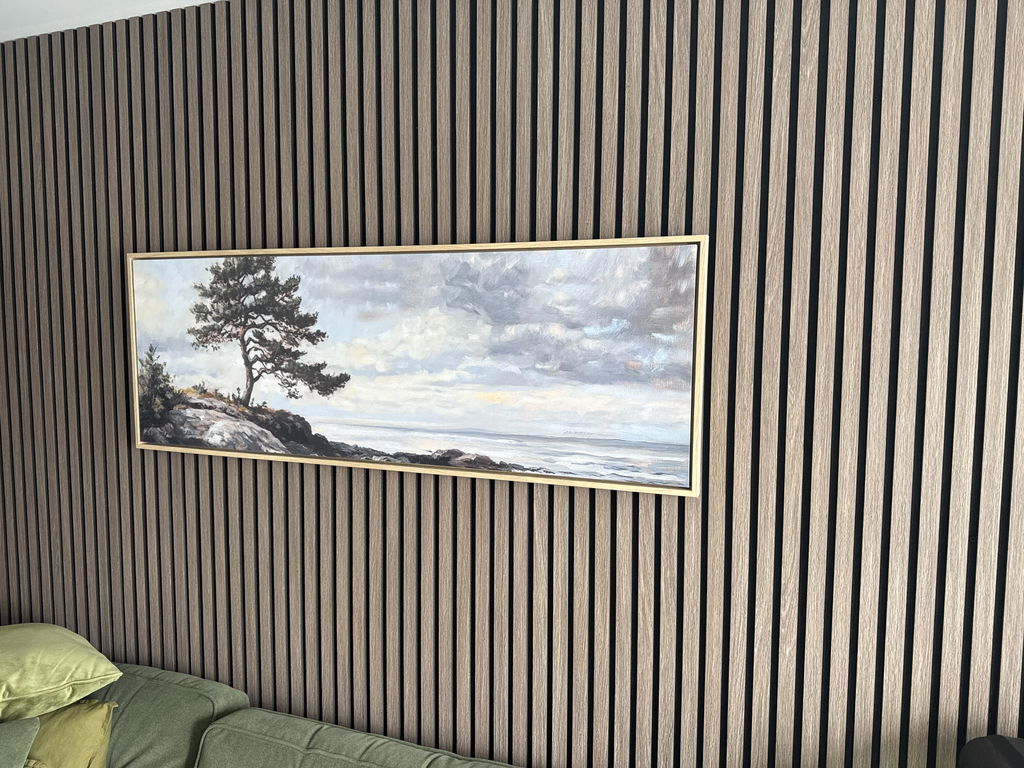
Beautiful, just as I wanted, excellent framing and a swift delivery
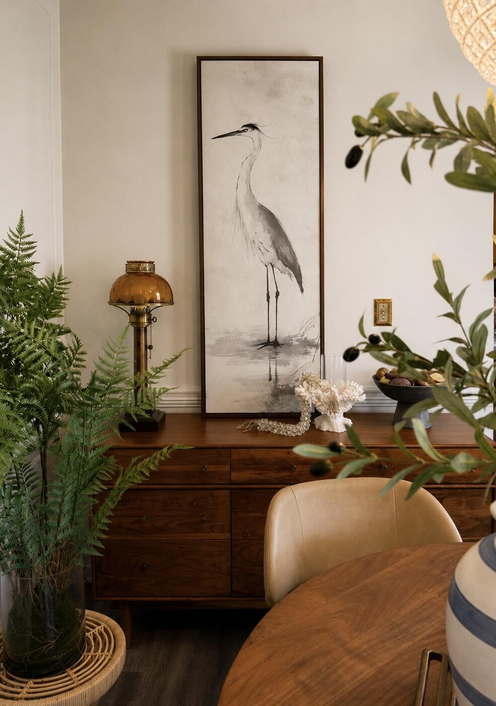
The perfect statement piece. The graceful heron, soft neutral palette, and walnut floating frame brought warmth and serenity to our dining room. It feels elegant, timeless, and collected rather than trendy. The quality is exceptional and the artwork looks even more beautiful in person than online. I love it so much, that I’m going to order another!
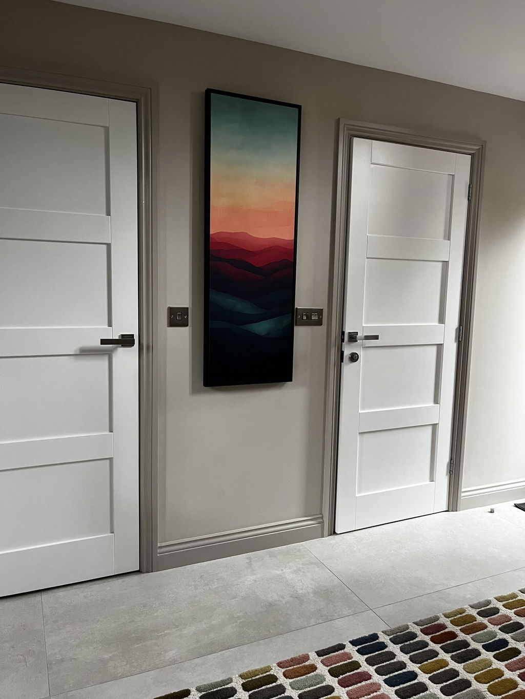
I’m over the moon with my beautiful Sunset wall art. It finishes off my hallway and has received so many compliments from visitors.
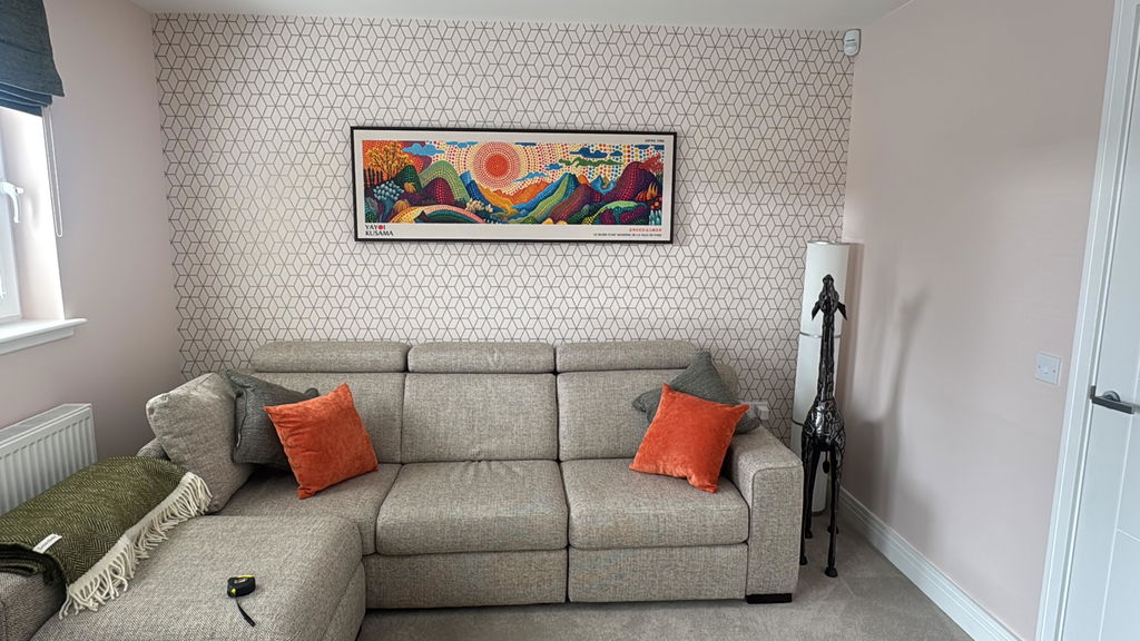
Second piece bought now and both are great. Exactly as described and very well packaged for transit.
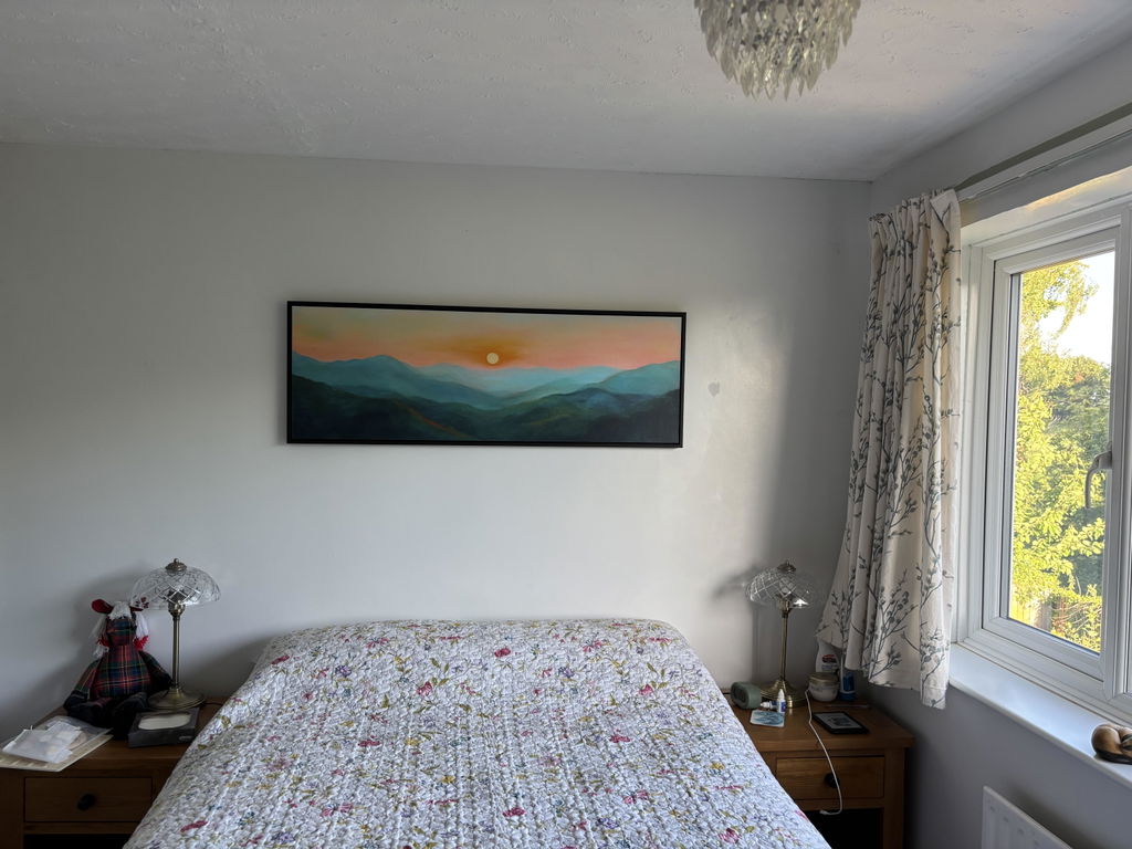
I love the quality and styling of the print, I was unsure about buying something so big without seeing it but I am very happy with the product. The colours are true to the image and the effect with the floating frame is perfect. I would buy again from Atelier, I trust the product and delivery was quick considering it was a specific design, size and frame.