


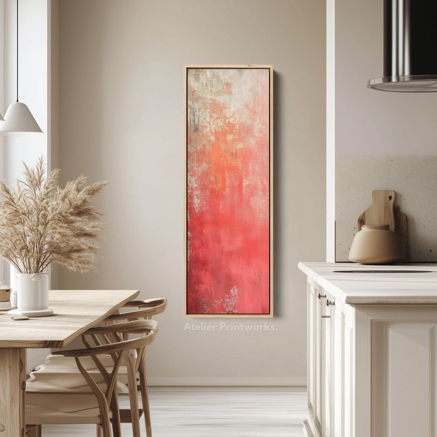
Art mural rouge
Œuvres murales rouges aux formats longs et étroits : des impressions sur toile conçues pour les couloirs, les escaliers et les espaces muraux exigus où les formats standard ne conviennent pas. Du cramoisi profond à l’écarlate vif, la collection comprend des œuvres abstraites audacieuses, des impressions d’inspiration japonaise, des motifs botaniques et des compositions modernes, en orientations verticale et horizontale.
Le rouge est une couleur à utiliser avec intention. Une longue pièce horizontale au-dessus d’un canapé ou d’une table à manger attire tous les regards dans une pièce aux tons neutres, tandis qu’une impression verticale et élancée apporte de la chaleur à un couloir ou une cage d’escalier sans l’encombrer. Les cramoisis plus profonds conviennent aux pièces anciennes et aux ambiances plus sombres ; les écarlates plus vifs s’accordent particulièrement bien avec des murs blancs ou pâles.
Chaque pièce est fabriquée sur commande dans une gamme de formats, sous forme de toile tendue ou avec un cadre flottant ou classique noir, blanc, en chêne, noyer ou doré, et arrive prête à être accrochée.


Red wall art - frequently asked questions
Dimensions, hauteur de suspension et les questions qui nous sont le plus souvent posées.
Is red wall art too much for a home?
Used once, deliberately, it is the most effective focal point you can put on a wall. A single long red canvas above a sofa or dining table gives a neutral room somewhere for the eye to land. Used twice in the same room, it stops being a focal point and starts being a colour scheme - which is a much harder thing to get right.
What wall colour works behind red art?
White and pale walls suit brighter scarlets - the contrast keeps the red clean. Deeper crimsons work better against a warmer or darker wall, where they read as rich rather than as loud. A red piece on a red-adjacent wall, such as terracotta, rarely works: the two compete instead of contrasting.
What rooms suit red wall art?
Dining rooms and living rooms, where a focal point is welcome and the room is used socially. Hallways take a single red piece well because you pass it rather than sit with it. It is the hardest colour to live with in a bedroom, where it tends to read as energising rather than restful.
What shades of red wall art are available?
Deep crimson through to vibrant scarlet, with some rust and burgundy at the warmer end. Crimson and burgundy suit period rooms and darker schemes and read as rich rather than bright; scarlet is the statement end and needs a pale wall and some space around it.
What styles does red wall art come in?
Bold abstracts, Japanese-inspired prints, botanicals and modern patterns, in both vertical and horizontal formats. The Japanese-inspired pieces are where red is most at home - it carries real meaning in that tradition - while the abstracts use it purely as energy.


Laissez-vous inspirer
Nos œuvres d'art, vos murs
Découvrez comment nos clients mettent en valeur les pièces d'Ateliér Printworks dans leurs intérieurs. Des couloirs étroits aux murs d'accent, ces espaces montrent comment les bonnes proportions font toute la différence.
Let customers speak for us
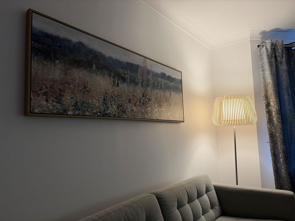
I love the canvas so much! Really finishes off the room! I turned my chair around because I just wasn’t to look at the canvas instead of the TV. The floating frame looks perfect. It’s a great blend of traditional but still with a modern clean look.
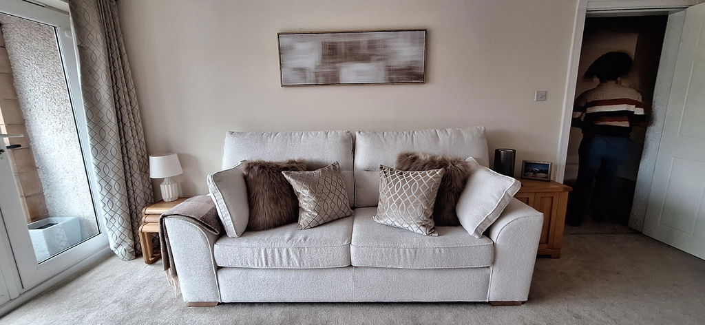
Great quality workmanship from the outset. The quality of the artwork is excellent and the accompanying frame makes the final product a standout in any room.
From the initial decision to the final delivery, the entire process was seamless, with the artwork delivered within five working days.
The hardest part was choosing which wall to hang the canvas on.
Thank you and I'm already looking towards make a further purchase.
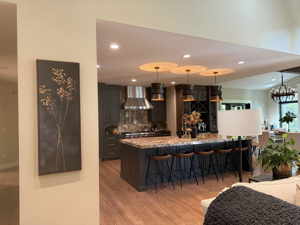
I have searched for a couple of years for a slender piece of art that would be the perfect complement to my kitchen. Scale and color were crucial as I didn’t want to distract from the elements in my kitchen. When this came across my Instagram feed I immediately ordered. The quality is excellent and delivery was fast!
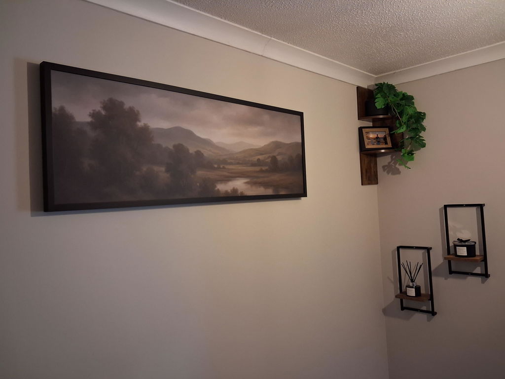
Absolutely Lovely Canvas. Fills the space and is beautifully made.
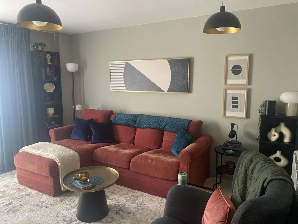
After much consideration I think the canvas I chose looks great for my space - beautifully made, stunning floating gold framed border - the only thing is I wished they used a different delivery service- the canvas arrived in IRL quickly - trying to get it delivered from UPS was a nightmare, I ended up collecting it from their warehouse. The canvase was worth it though.
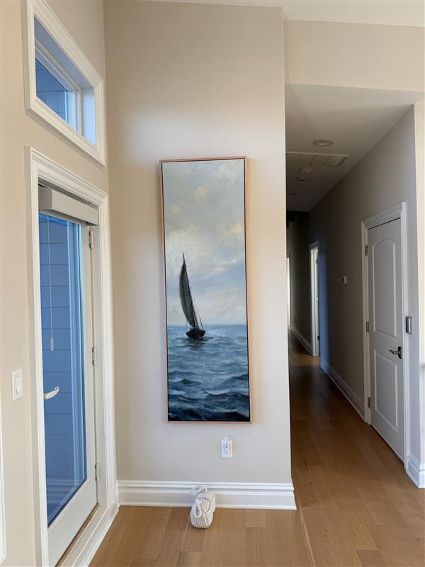
Love this piece! Fit the tall narrow wall exactly as we had hoped. Very impressed with the sturdiness of the piece itself, and the packing/shipping was done professionally.
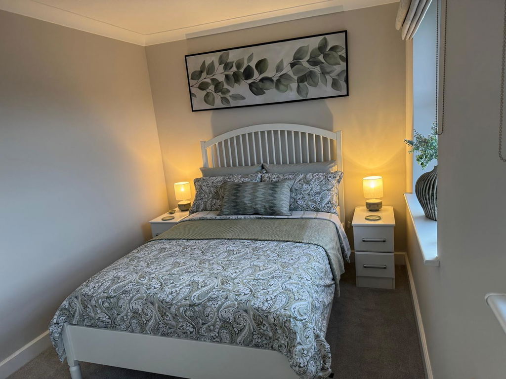
Excellent service, picture looks amazing and arrived very quickly and was very well packaged. Easy to install on the wall and looks superb..
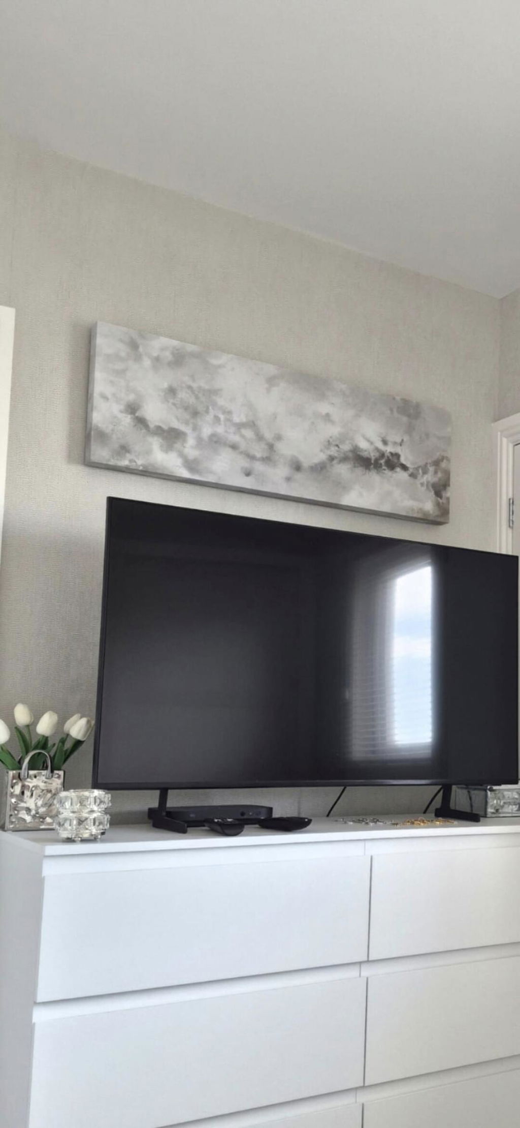
Lovely picture, great quality and supernatural delivered. Would definitely recommend
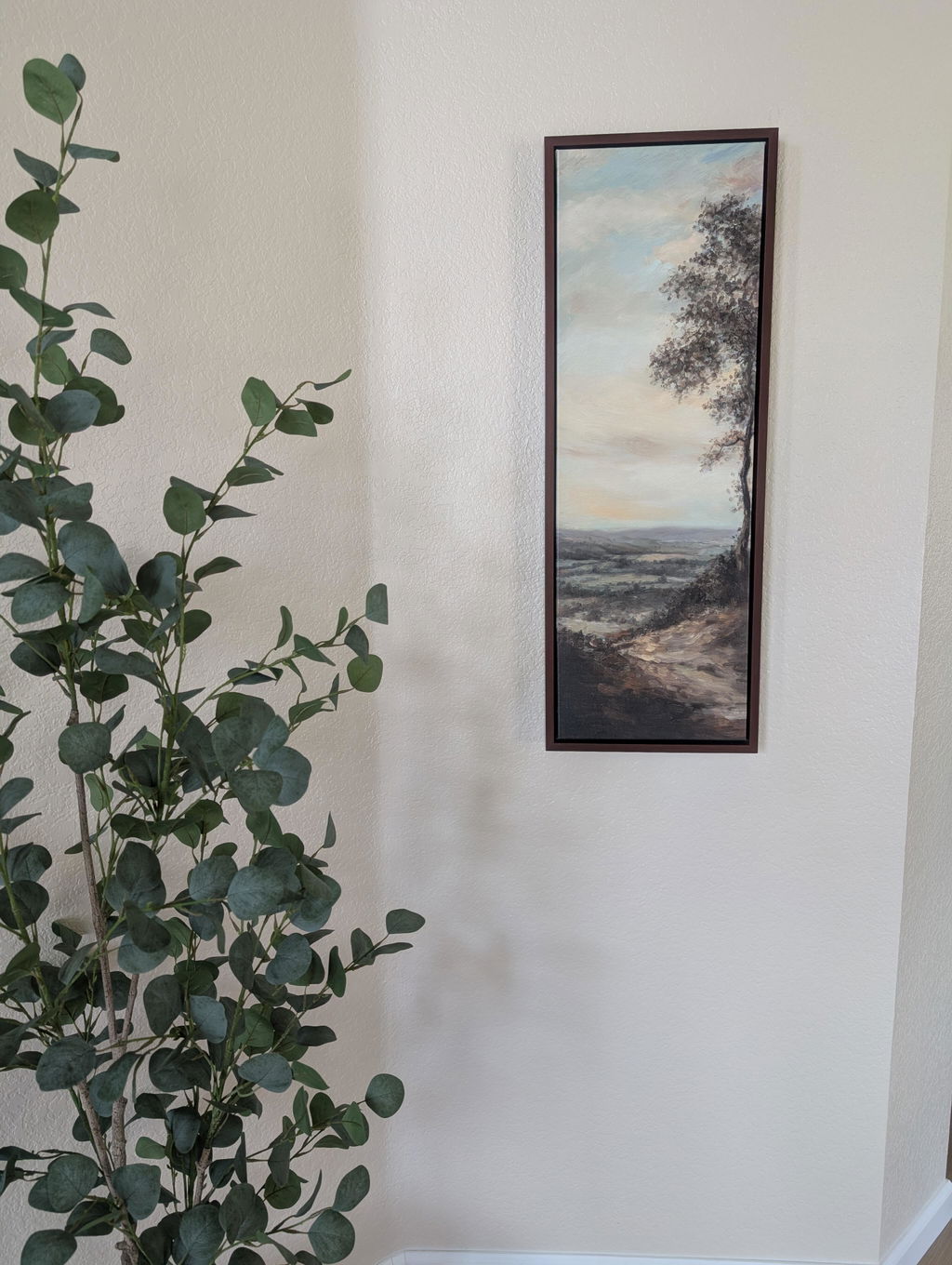
Beautiful picture for a narrow wall. The colors are prettier in person.
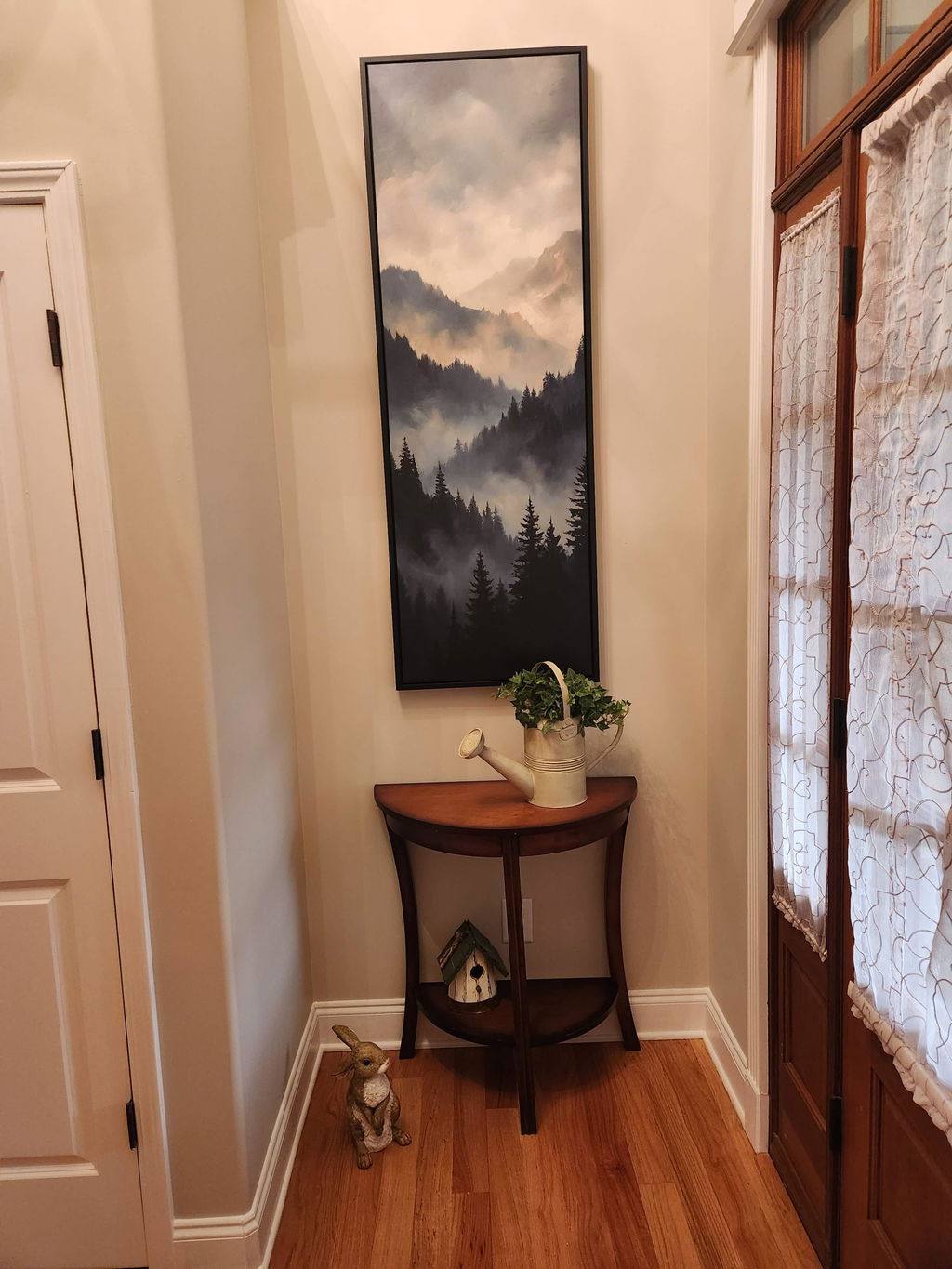
We received our print in a timely manner. Upon unpacking, we noticed a bulge in the canvas and some lines in the canvas and imprint from the wood that goes across in the back. I reached out and the company sent another one that came perfect. It is now displayed in our foyer and looks great!
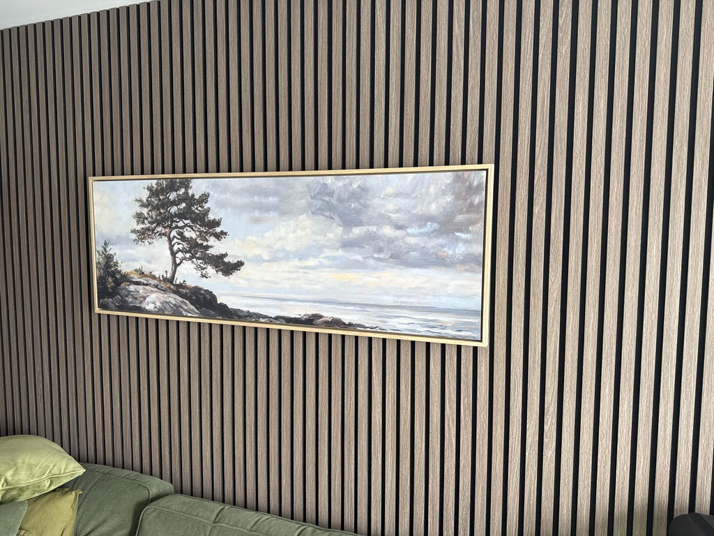
Beautiful, just as I wanted, excellent framing and a swift delivery
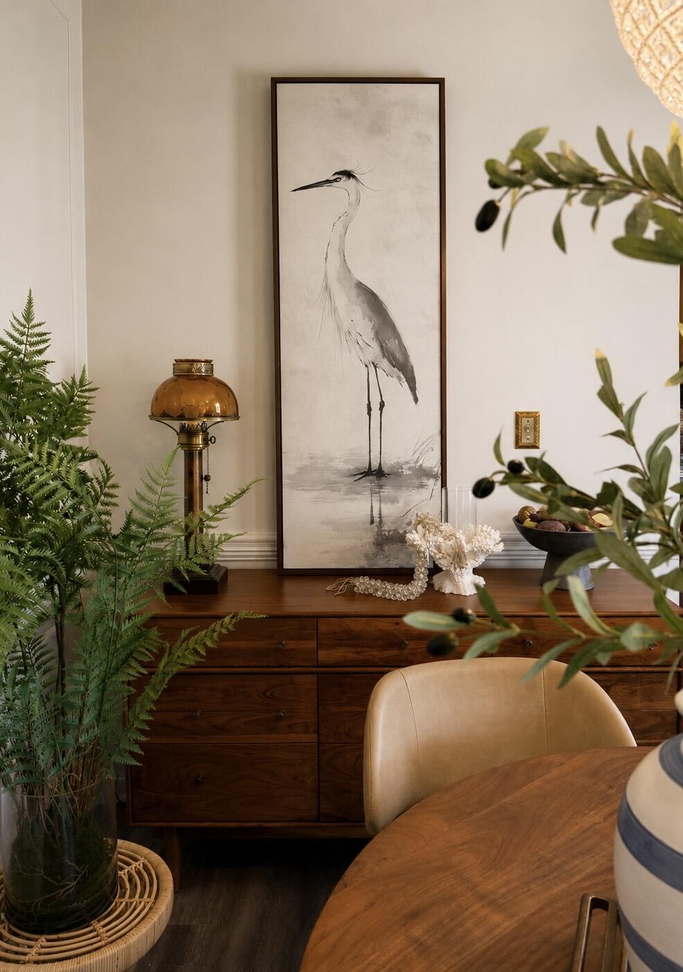
The perfect statement piece. The graceful heron, soft neutral palette, and walnut floating frame brought warmth and serenity to our dining room. It feels elegant, timeless, and collected rather than trendy. The quality is exceptional and the artwork looks even more beautiful in person than online. I love it so much, that I’m going to order another!
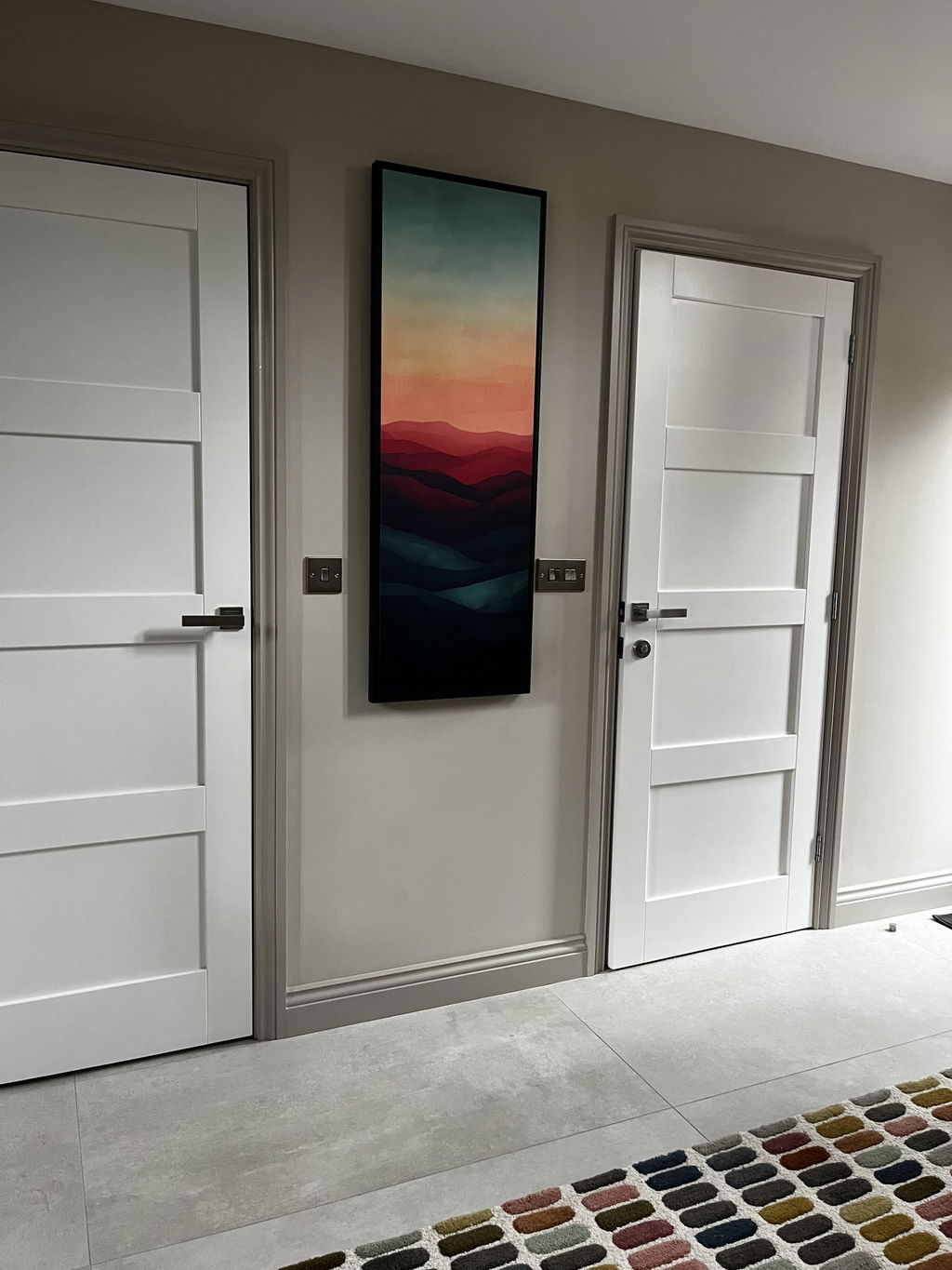
I’m over the moon with my beautiful Sunset wall art. It finishes off my hallway and has received so many compliments from visitors.
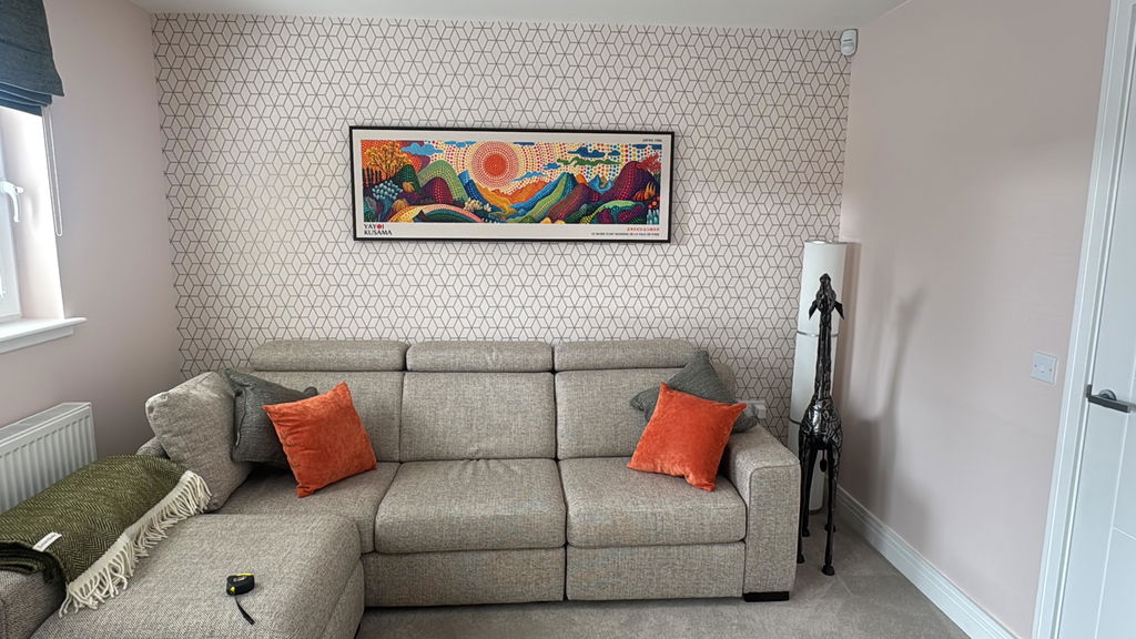
Second piece bought now and both are great. Exactly as described and very well packaged for transit.
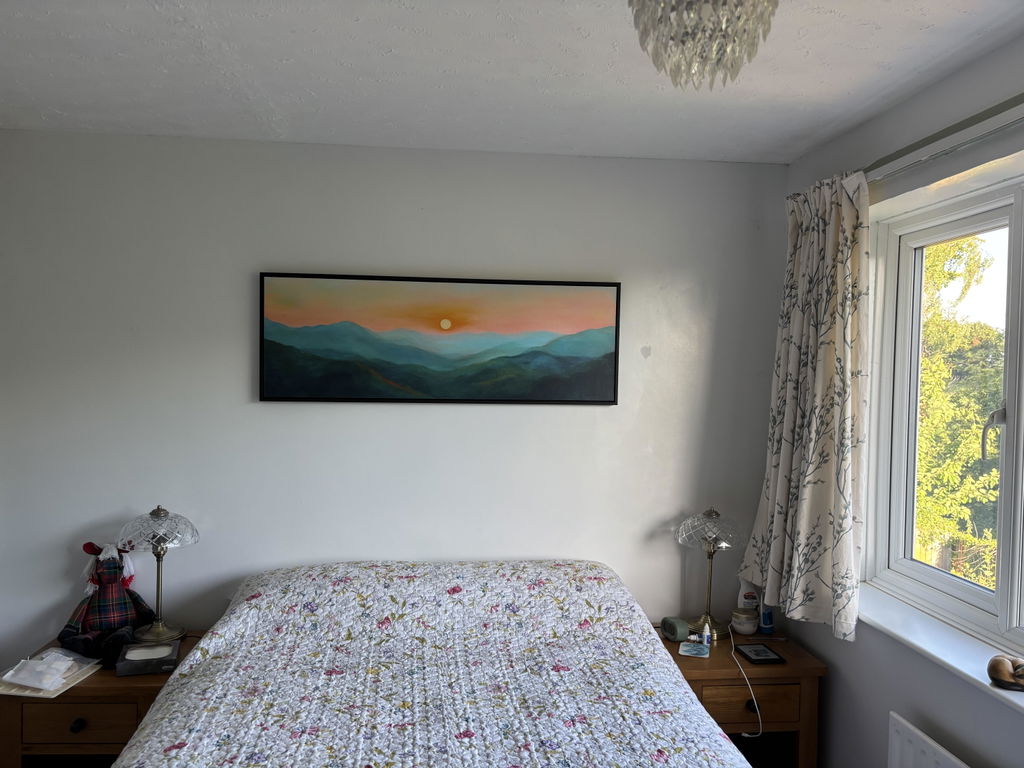
I love the quality and styling of the print, I was unsure about buying something so big without seeing it but I am very happy with the product. The colours are true to the image and the effect with the floating frame is perfect. I would buy again from Atelier, I trust the product and delivery was quick considering it was a specific design, size and frame.