


Art mural typographique
Art mural typographique dans des formats longs et étroits : des impressions sur toile encadrées qui transforment les mots, les phrases et les simples lignes en œuvres d’art. La typographie se prête plus naturellement aux formats allongés que presque tous les autres sujets : une ligne de texte se lit sur une toile horizontale, tandis qu’un seul mot s’empile harmonieusement sur une toile verticale et élancée.
La collection va du lettrage discret et minimaliste dans des tons neutres doux à des compositions graphiques plus audacieuses, avec des mises en page épurées et des polices soigneusement choisies. Ces œuvres trouvent leur place dans les couloirs et paliers, les bureaux à domicile, les cuisines, ainsi que sur les murs étroits à côté des portes, là où une image semblerait trop imposante.
Chaque pièce est fabriquée sur commande dans un large choix de dimensions, sur toile tendue ou dans un cadre flottant ou classique noir, blanc, en chêne, noyer ou doré, et arrive prête à être accrochée.


Typography wall art - frequently asked questions
Dimensions, hauteur de suspension et les questions qui nous sont le plus souvent posées.
Why does typography suit a long narrow canvas?
Because text is naturally linear. A line of words reads across a horizontal canvas the way it reads on a page, and a single word stacks neatly down a tall vertical one. Set the same text in a square frame and it has to be broken into awkward lines or shrunk to fit - the elongated format is simply the right shape for the content.
Does typography wall art date quickly?
It can, if the phrase is a trend. Quiet, minimal lettering and single words age far better than slogans, and a piece where the typeface and layout are the interest - rather than the sentiment - has a much longer life on a wall. If you want something to keep, choose restraint over a message.
What rooms suit typography wall art?
Hallways and landings, home offices, kitchens, and the narrow walls beside doorways - anywhere an image would feel like too much but a blank wall feels unfinished. It is a weaker choice above a bed or sofa, where a piece you look at for long periods benefits from being open to interpretation rather than saying something specific.
What size should typography wall art be?
Big enough to read comfortably from where you will stand. In a hallway you pass close to, 12"x36" (30x90cm) is plenty. On a living room or office wall seen from across the room, 20"x60" (50x150cm) gives the lettering the presence it needs. Text is the one subject where legibility, not proportion, sets the minimum size.
What frame suits typography wall art?
Black or white, in most cases. Typography is a graphic subject and a plain, hard-edged frame lets the lettering stay the focus; wood and walnut soften it in a way that can work against the design. A stretched canvas with no frame at all is the cleanest option for minimal lettering.


Laissez-vous inspirer
Nos œuvres d'art, vos murs
Découvrez comment nos clients mettent en valeur les pièces d'Ateliér Printworks dans leurs intérieurs. Des couloirs étroits aux murs d'accent, ces espaces montrent comment les bonnes proportions font toute la différence.
Let customers speak for us
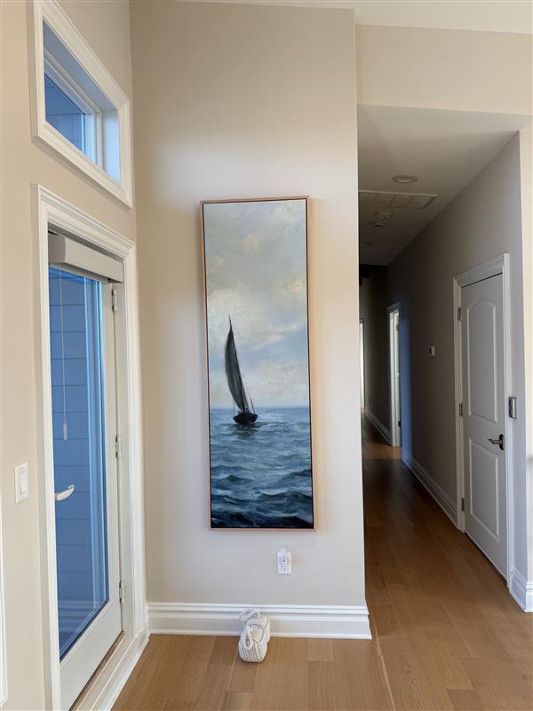
Love this piece! Fit the tall narrow wall exactly as we had hoped. Very impressed with the sturdiness of the piece itself, and the packing/shipping was done professionally.
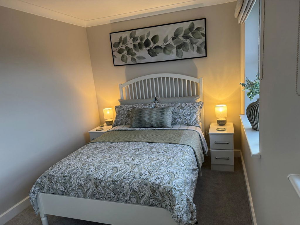
Excellent service, picture looks amazing and arrived very quickly and was very well packaged. Easy to install on the wall and looks superb..
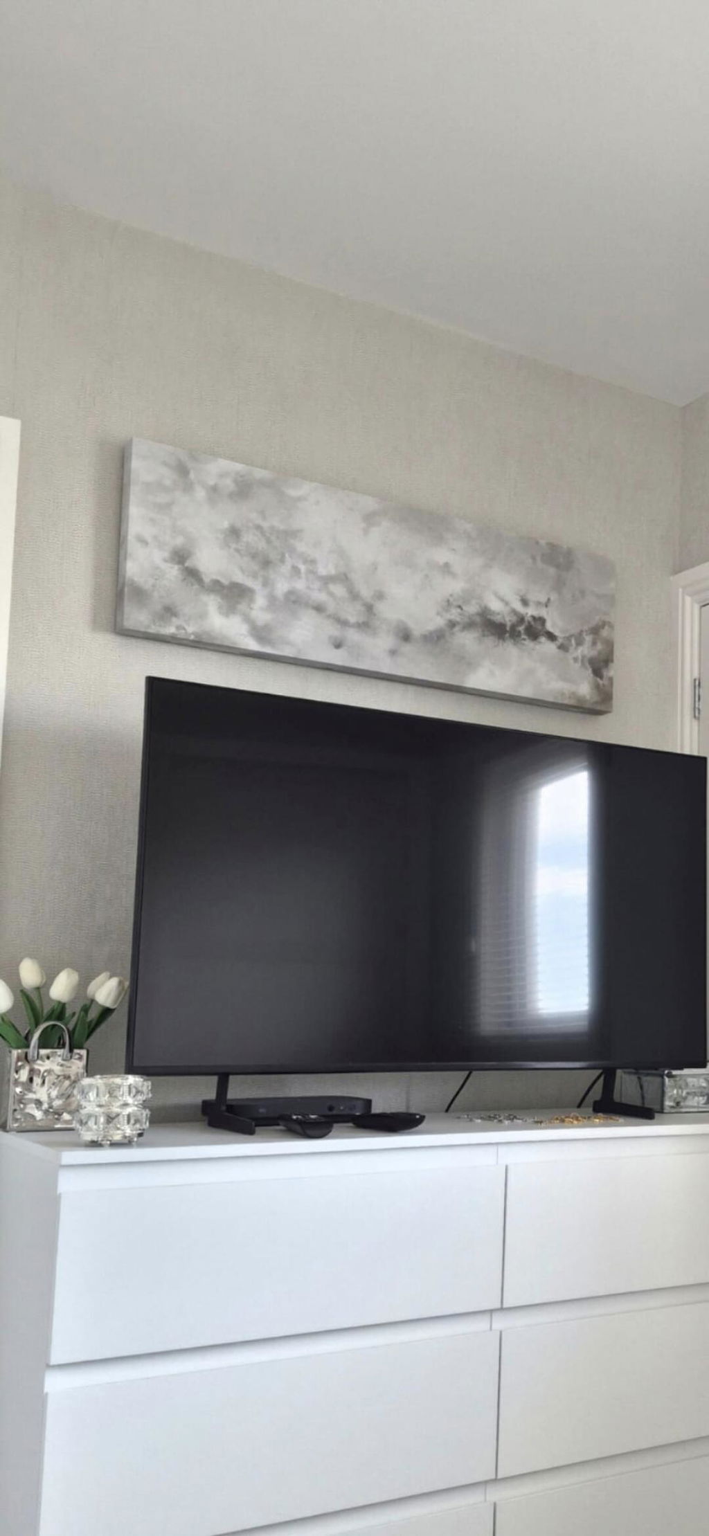
Lovely picture, great quality and supernatural delivered. Would definitely recommend
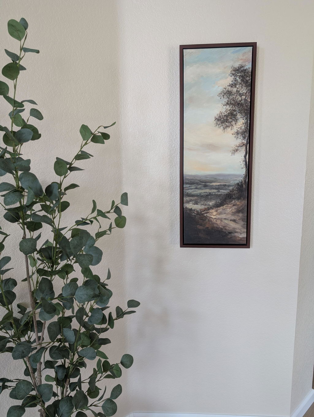
Beautiful picture for a narrow wall. The colors are prettier in person.
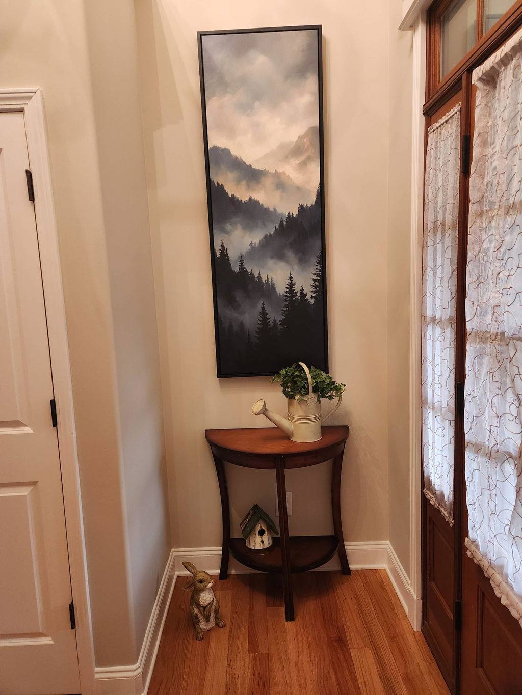
We received our print in a timely manner. Upon unpacking, we noticed a bulge in the canvas and some lines in the canvas and imprint from the wood that goes across in the back. I reached out and the company sent another one that came perfect. It is now displayed in our foyer and looks great!
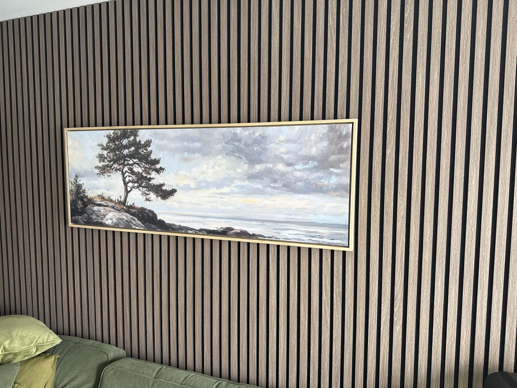
Beautiful, just as I wanted, excellent framing and a swift delivery
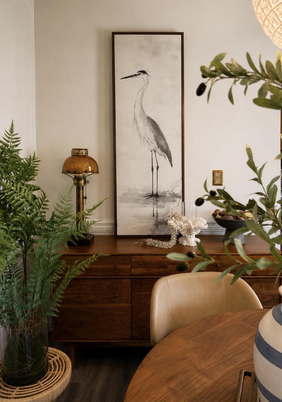
The perfect statement piece. The graceful heron, soft neutral palette, and walnut floating frame brought warmth and serenity to our dining room. It feels elegant, timeless, and collected rather than trendy. The quality is exceptional and the artwork looks even more beautiful in person than online. I love it so much, that I’m going to order another!
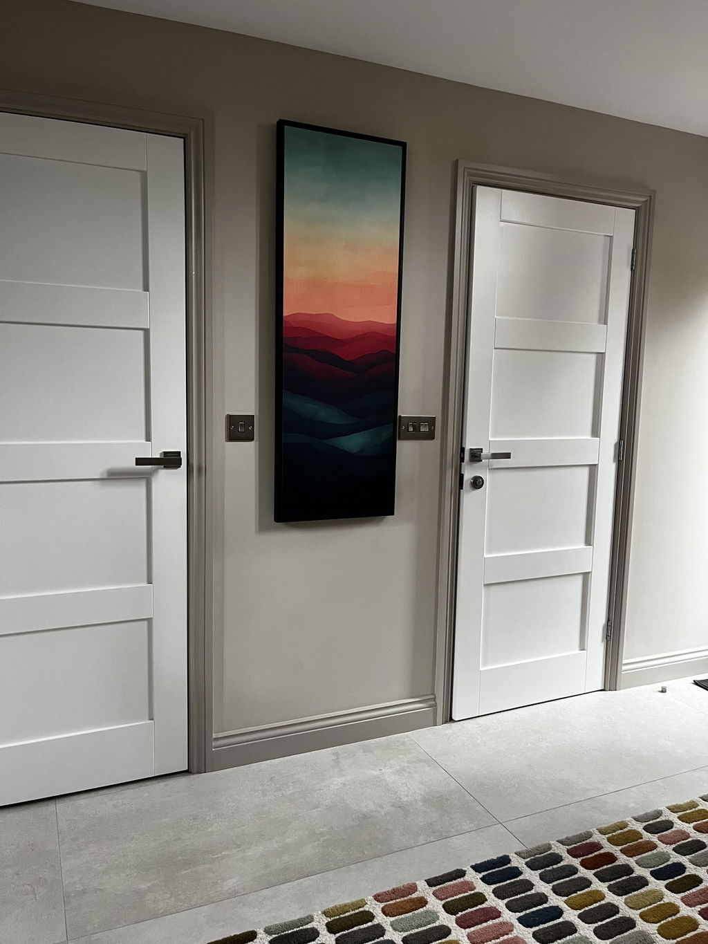
I’m over the moon with my beautiful Sunset wall art. It finishes off my hallway and has received so many compliments from visitors.
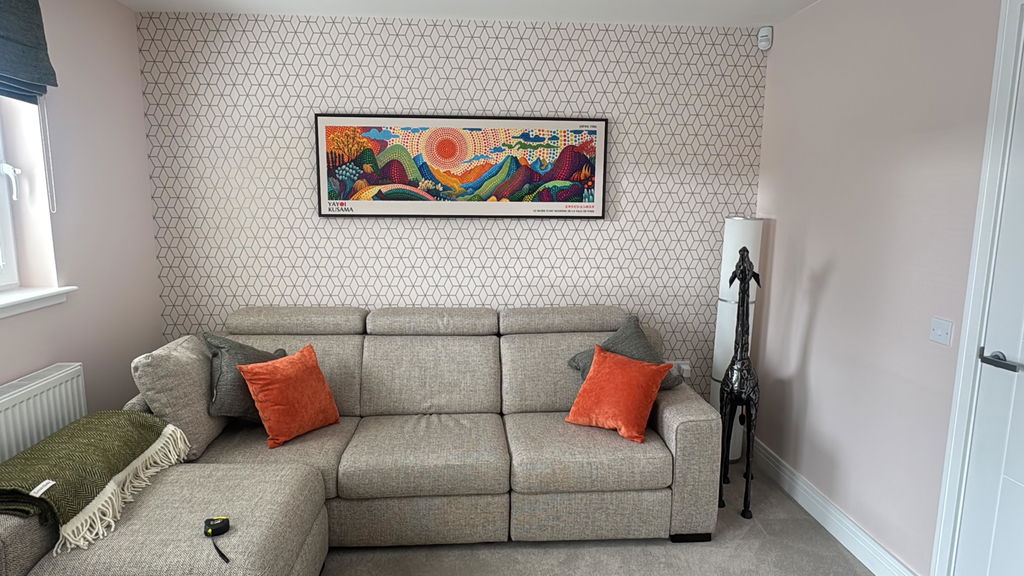
Second piece bought now and both are great. Exactly as described and very well packaged for transit.
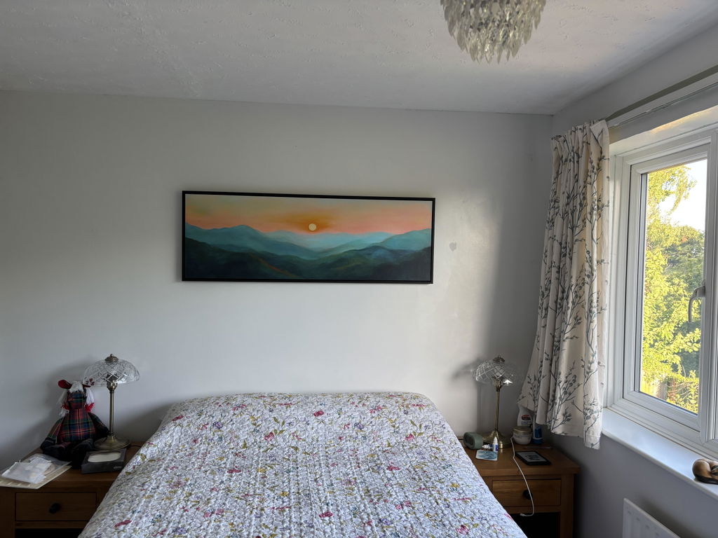
I love the quality and styling of the print, I was unsure about buying something so big without seeing it but I am very happy with the product. The colours are true to the image and the effect with the floating frame is perfect. I would buy again from Atelier, I trust the product and delivery was quick considering it was a specific design, size and frame.
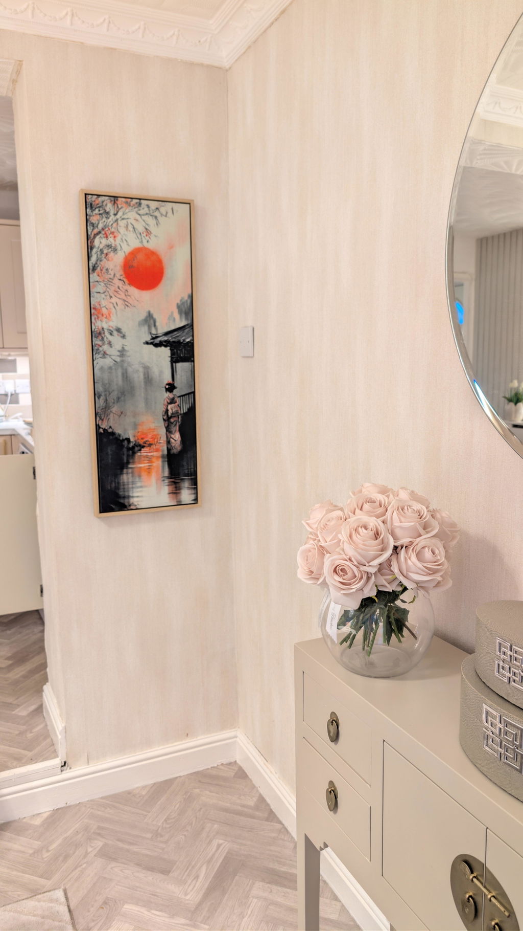
I bought the 30 x 90 canvas with a floating canvas frame in the colour wood and I couldn't be happier with it. Great quality, well packaged. Highly recommend.
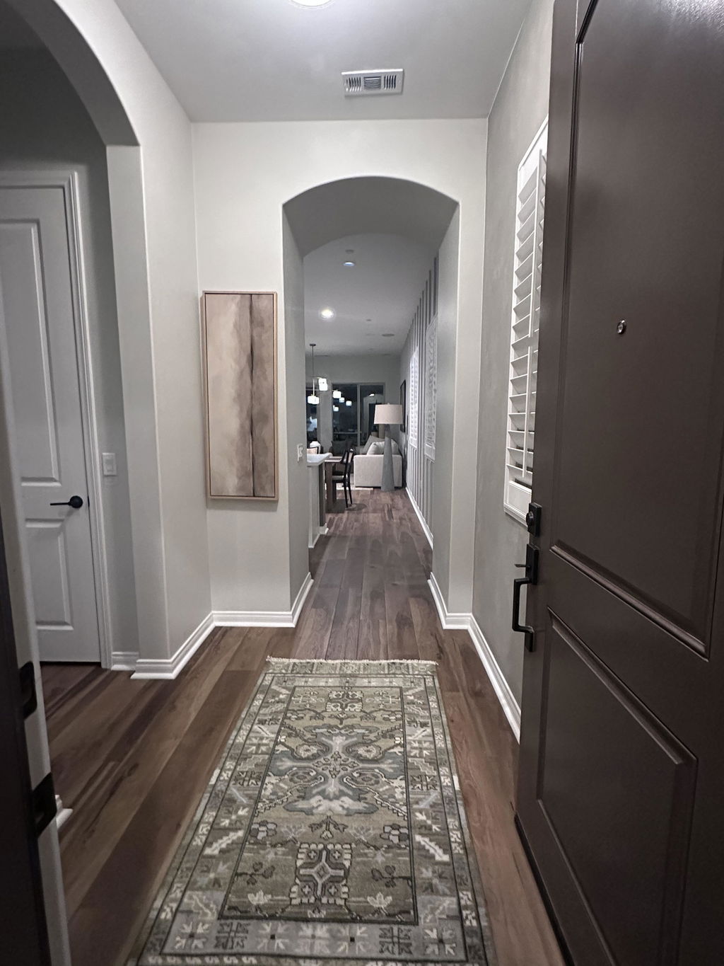
This artwork brought just the right look to my entry that I was trying to achieve. It’s beautiful and calming and in a beautiful quality frame.
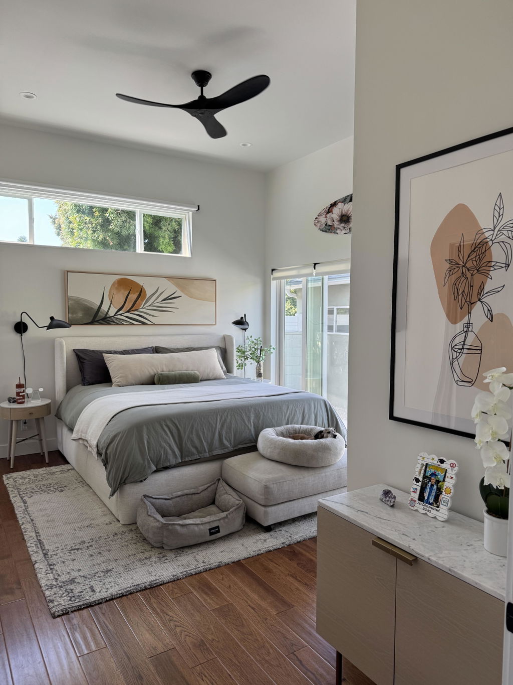
Better than presented online. We love it. Super high quality framing and hardware.
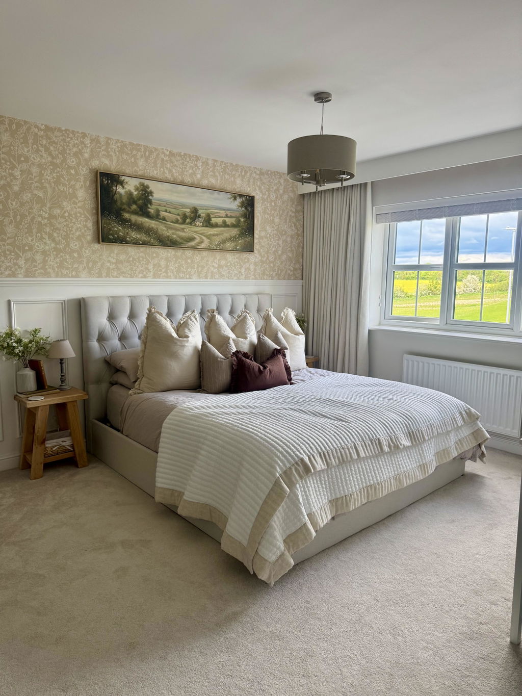
Beautiful artwork! So impressed with the quality, it looks absolutely stunning.
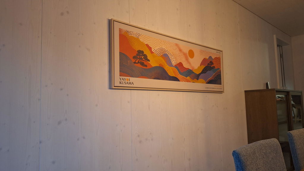
Beautiful!